Google Photos:
A Redesign Towards Consistency and Playfulness
Overall Skills
Sketching
Add your pricing strategy. Be sure to include important details like value, length of service, and why it’s unique.
Cultural Probing
Add your pricing strategy. Be sure to include important details like value, length of service, and why it’s unique.
Prototyping
Add your pricing strategy. Be sure to include important details like value, length of service, and why it’s unique.
Defining The Problem
One day I randomly opened up the Google Photos app on my phone as I was looking for a specific picture. However, what I was struck with was an interface the seemed confusing, inconsistent and honestly a bit uninspiring.
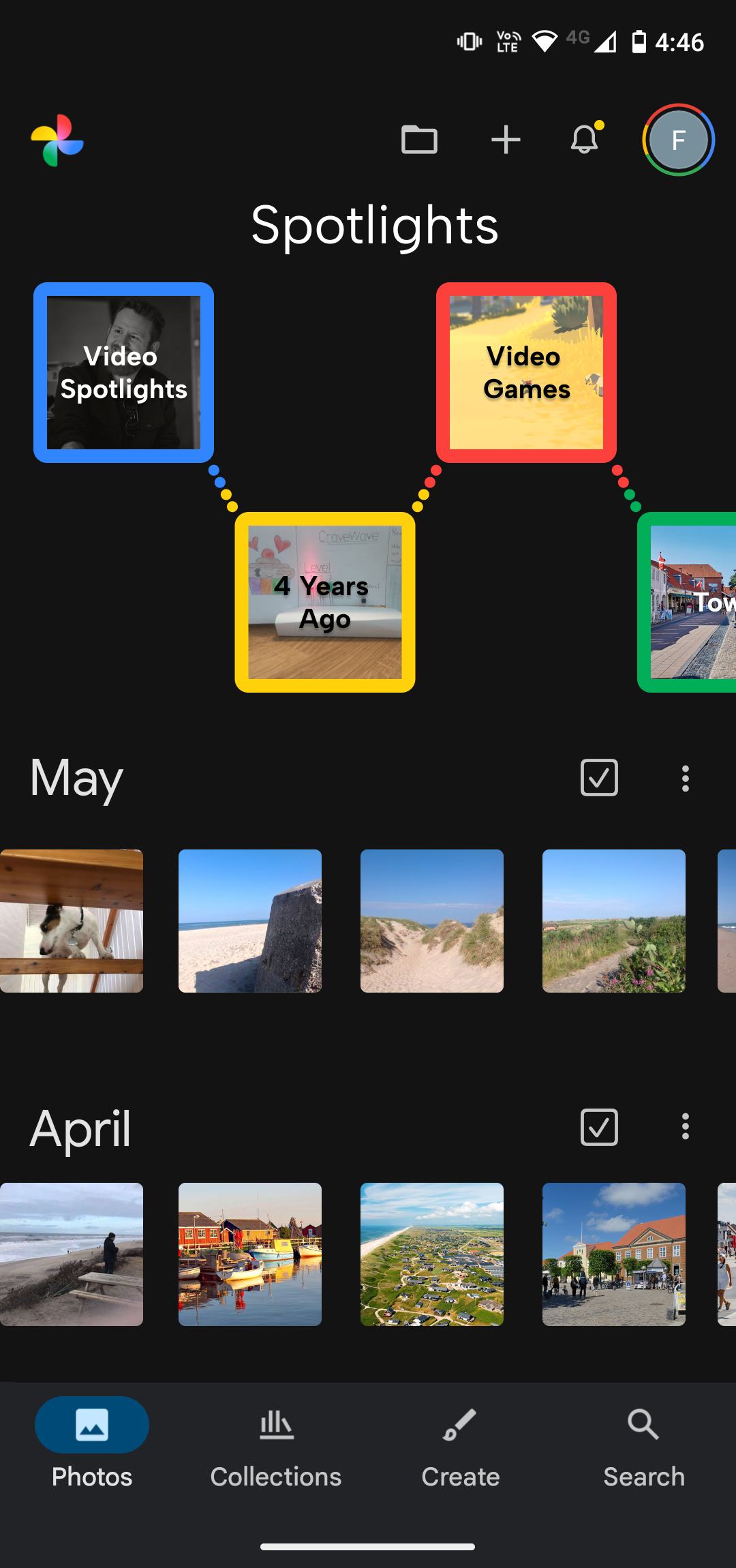
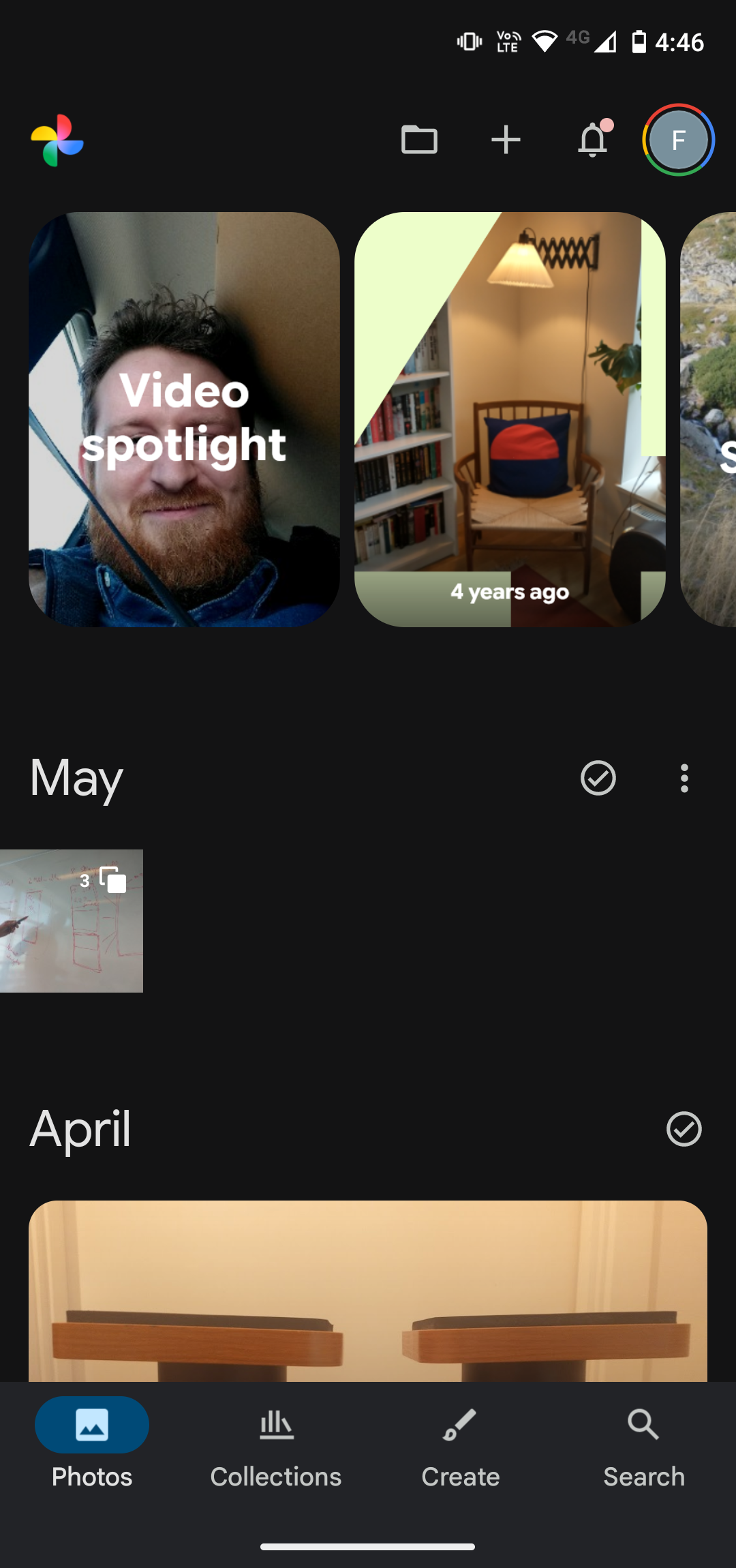
As we know from Don Norman, “discoverability” is one of the seven fundamental design principles - meaning how easy it is to determine what is possible and the current state of the system (Norman, 2013). However, when looking at the first screenshot on the right Google Photos presents itself as being confusing…at least to me. Why does every month have a different layout? Why does May have a settings button but not April? Why do some pictures have sharp corners and other rounded?
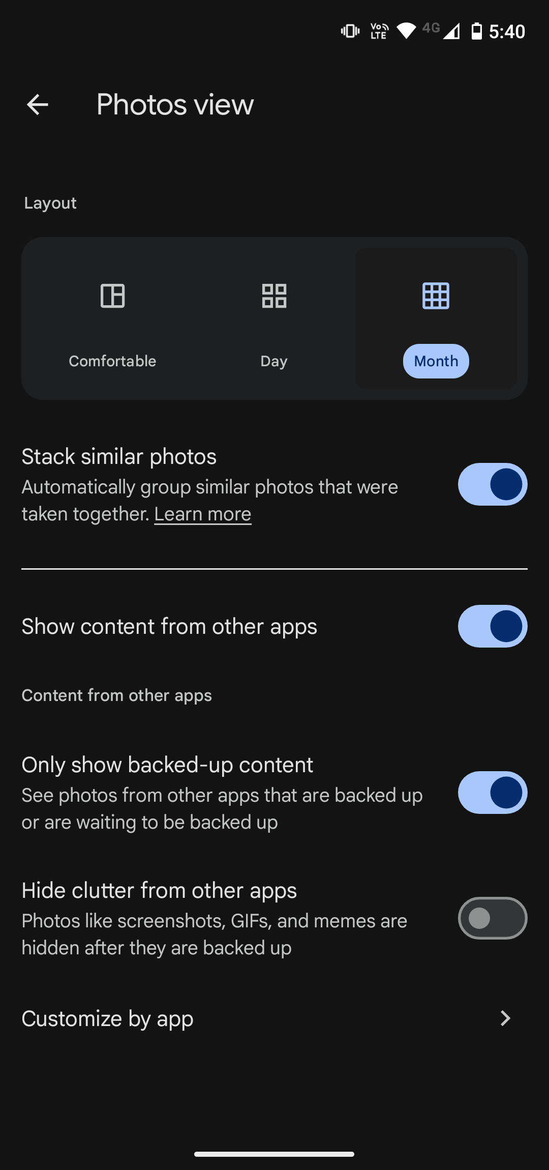
Additionally, I felt the overall aesthetics of Google Photos for one did not match the creativity of picture taking and the brand of Google either. Of their four iconic colors, they only use a shade of the blue one, as can be seen in the settings menu on the right hand side.
Therefore I set out to try and redesign the user interface and user experience of Google Photos, along with adding some sound to give the app a more playful feel whilst improving the feedback.

Improving The Main Screen

The Final Design
The final design of “The Life Tree” is a modular telephone, allowing the user to expand upon their network by adding more branches. Calls are made by touching the branch of the household they want to call - and calls are played through a speaker.
Since privacy was still a concern, each household has a leaf, signalling by color and position whether or not a household is available to call.
It was designed to fit into most households in an aesthetic way, almost like a sculpture.
The first thing I did on the main screen was to ensure consistency in the “month” views. Here, the focus was to show as much content from the month as possible.