Oppo:
Designing Sounds For A New “Aquamorphic” Operating System
Overall Skills
Sound Design
Assisted in creating UI/UX sounds for the project.
Project Management
Led the project from start to finish and ensured that we stayed within budget and the deadline.
Collaboration Facilitation
Facilitated collaboration between differences in culture and country.
Aquamorphism
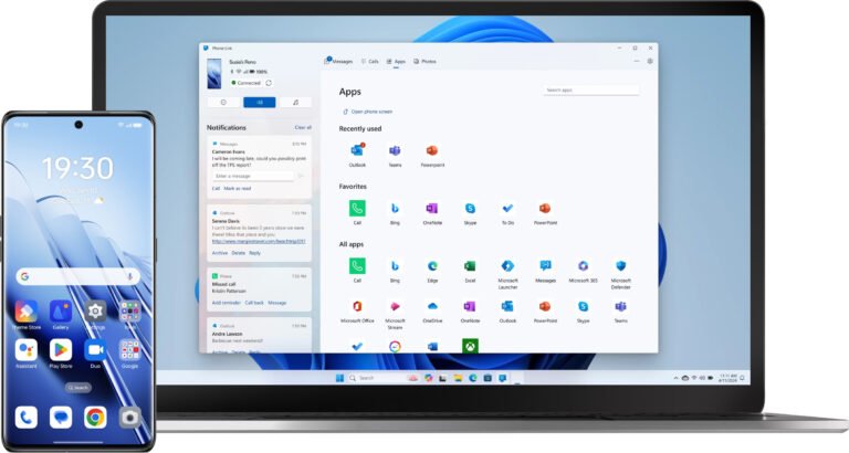
During my time as Sonic Minds, I had to opportunity to work with Oppo and their new operating system Color OS 14. In a collaboration with Epic Sound, we were tasked with creating UI/UX sounds for their new design direction, which they called “Aquamorphism 2.0”.
Aquamorphism 2.0 represented a clear vision for how they wanted they products to feel and be represented. This vision was based upon the movement and effects of water, its ability to move flowingly, adapt intelligently and be nourishing to the human mind, body and spirit.
My role in the project was to assist with sound production, manage the project and help facilitate collaboration between the Danish culture and the Chinese culture.
Culture and Meaning
Designing The Sounds
From these descriptors we designing sounds that were subtle, pleasant and minimal whilst still having an evocative effect on the users.
For the shorter UI sounds, water droplets were used as an inspiration as they were both short, dynamic and pleasant to listen to. However, we did not want the sounds to aesthetically sound like water, rather we wanted them reflect the auditory movement of water.
From this point of view, we explored various synthesized soundscapes that we iteratively worked through to find the right aesthetic for aquamorphism.
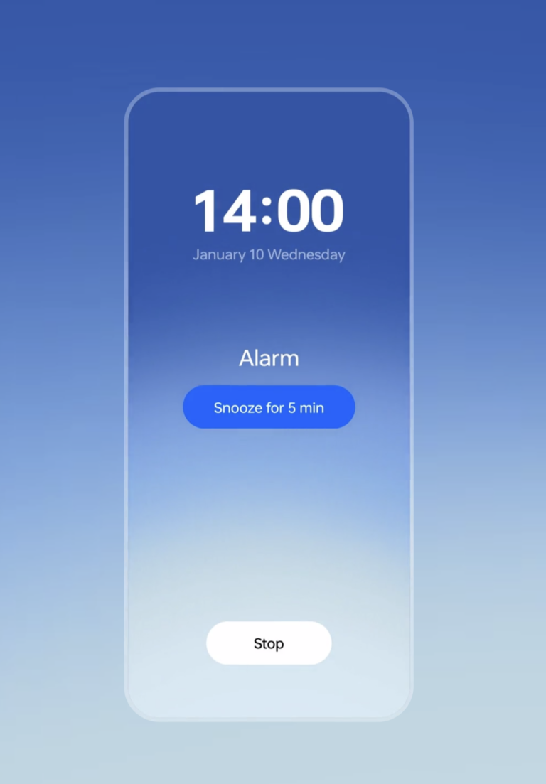
For longer UI sounds such as alarms and confirmations, inspiration was taken from larger pools of water and the sounds of waves.
One of the hardest elements of working across cultures and languages is aligning expectation and understanding how meaning arises differently from certain words, visual elements, sounds and so on.
Therefore, to start off the project, we conducted a handful of workshops in order to understand Oppo, the meaning they gathered from certain words, and how they responded to certain types of sound. From this, we aligned on three overall descriptors: Alive, Intelligent Dynamics and Elegant/Enriching.
These descriptors formed the baseline from which we created the UI sounds and from which we could facilitate cross-cultural understanding as our understanding of these descriptors were the same.
Click On This Link To Hear Some of Sounds Created For Oppo