TRIPLE-A:
Pushing Forwards AI and Automation in Anaesthesia
Overall Skills
UI/UX
Creation of the User Interface and well as the User Experience.
Project Management
Leading the design from start to finish
Co-Design
Deep involvement of stakeholders throughout the design process.
TRIPLE-A
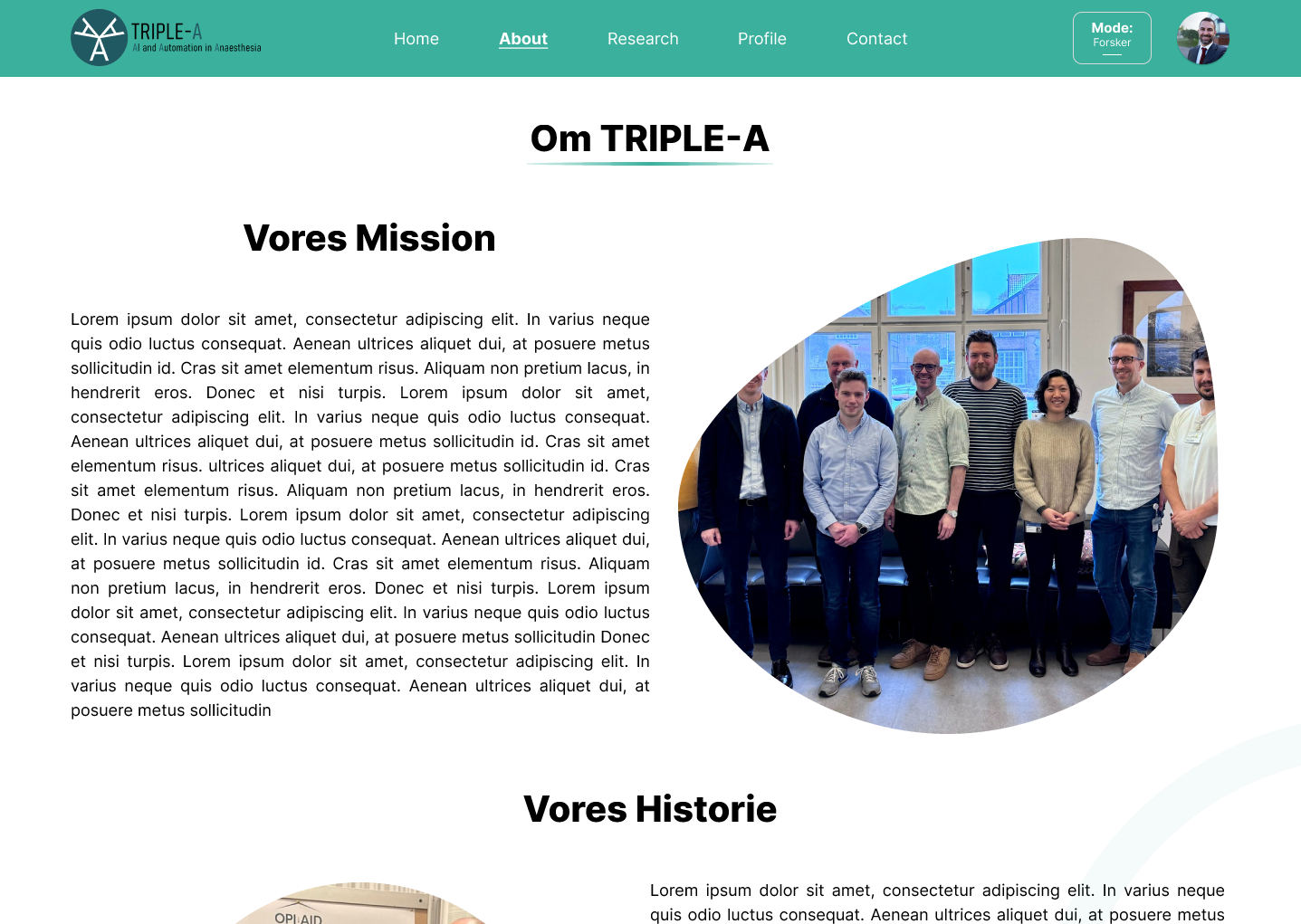
TRIPLE-A is a Danish organization consisting of anaesthesiologists seeking to explore and implement the usage of AI and Automation in clinical practice. TRIPLE-A has their own database with data on 1.1 million surgeries.
A part of that vision is their website, allowing researchers and medical students to apply for access to this database to aid their own research.
My job was to design the User Interface and User Experience of the website, all the way from making a profile, filling out forms, to getting access to the database.
The project is still in development, so some screenshots are still placeholder.
What Do People Want?
Provotyping
A key part of the process was also employing provotypes in interviews with researchers and students. This allowed me to get a sense of what they liked and what they didn’t like in regards to design.
It also allowed me to get a sense of the differences between users, how the website could be designed to accommodate different use-cases, and finally how this could be done without sacrificing the original vision of the TRIPLE-A project.
In the end, the project is still in development and changes are still being made. Future iterations of website will include introducing users to hi-fi prototypes that are more akin to the final product, as well as testing functionality and feasibility with the users themselves.
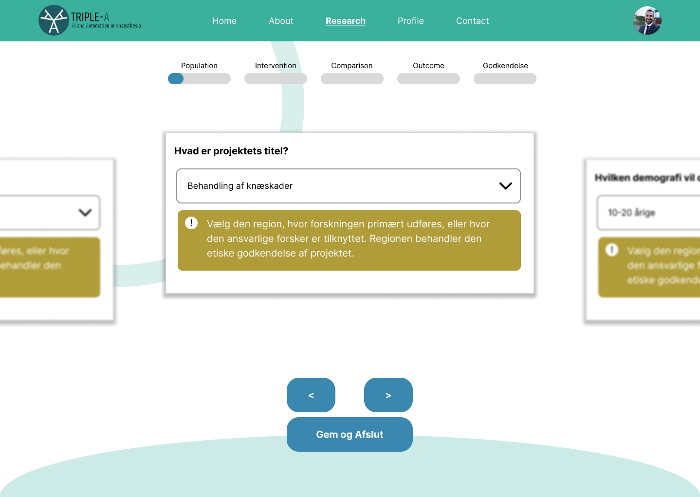
A core part of this project was to figure out how researchers and medical students work, how they usually get access to databases, and how we can make the experience of the website better for them.
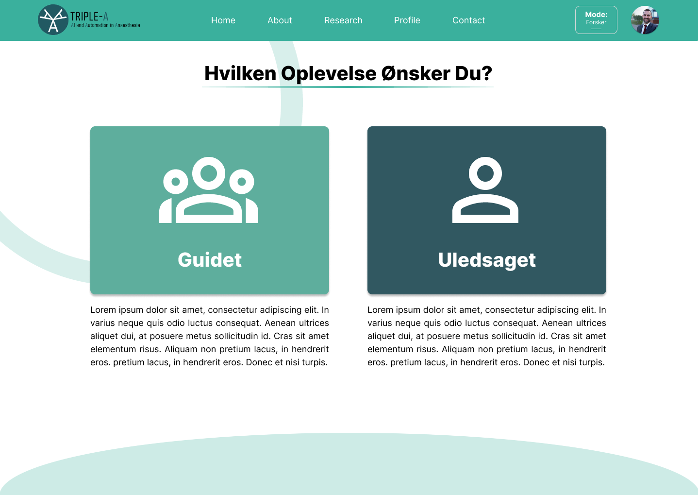
A key part of their problem was filling out lots of confusing form, separated into a lot of different bureaucratic actors. Therefore, the website primarily uses a guided experience, having the users only answers one questions at a time through the use of “cards” in a carousel view.
Through this view, the users answers every single question that they need to answer, and afterwards the website generates the forms they need (with the answers embedded), to send out for approval.
A unguided version was also designed, to make it usable for users who are used to the traditional workflow.